The package's single data-on-calendar renderer (the analogue of
geoscales::geoscale_plot()): callers prepare a data.frame keyed by timeslice
and hand it over. With no data, the calendar's own share is drawn — a
quick structural view. Layout follows the calendar's hierarchy: finest
timeframe on y, next-finest on x, anything coarser as facets
(overridable via x_tf/y_tf/facet_tf).
Usage
calendar_plot(
  x,
  data = NULL,
  values = NULL,
  key = "timeslice",
  x_tf = NULL,
  y_tf = NULL,
  facet_tf = NULL,
  fun = mean,
  palette = NULL,
  ...
)
Arguments
- x
A
Calendar.- data
Optional
data.framewith akeycolumn of timeslice IDs plus one numeric value column (pick withvalues=if there are several). DefaultNULLplotsleaves$share.- values
Name of the value column to plot. Default: the first numeric column other than
key.- key
Name of the timeslice key column in
data. Default"timeslice".- x_tf, y_tf, facet_tf
Timeframe names overriding the automatic layout.
- fun
Aggregator applied when the chosen layout drops timeframes (e.g. plotting an hourly calendar by MONTH x HOUR averages over days). Default
mean.- palette
NULL(default) keeps ggplot2's default continuous gradient; a viridis option letter/name opts in.- ...
Ignored (future extension).
Examples
if (requireNamespace("ggplot2", quietly = TRUE)) {
  calendar_plot(calendar("m12_h24"))   # structure: share heatmap

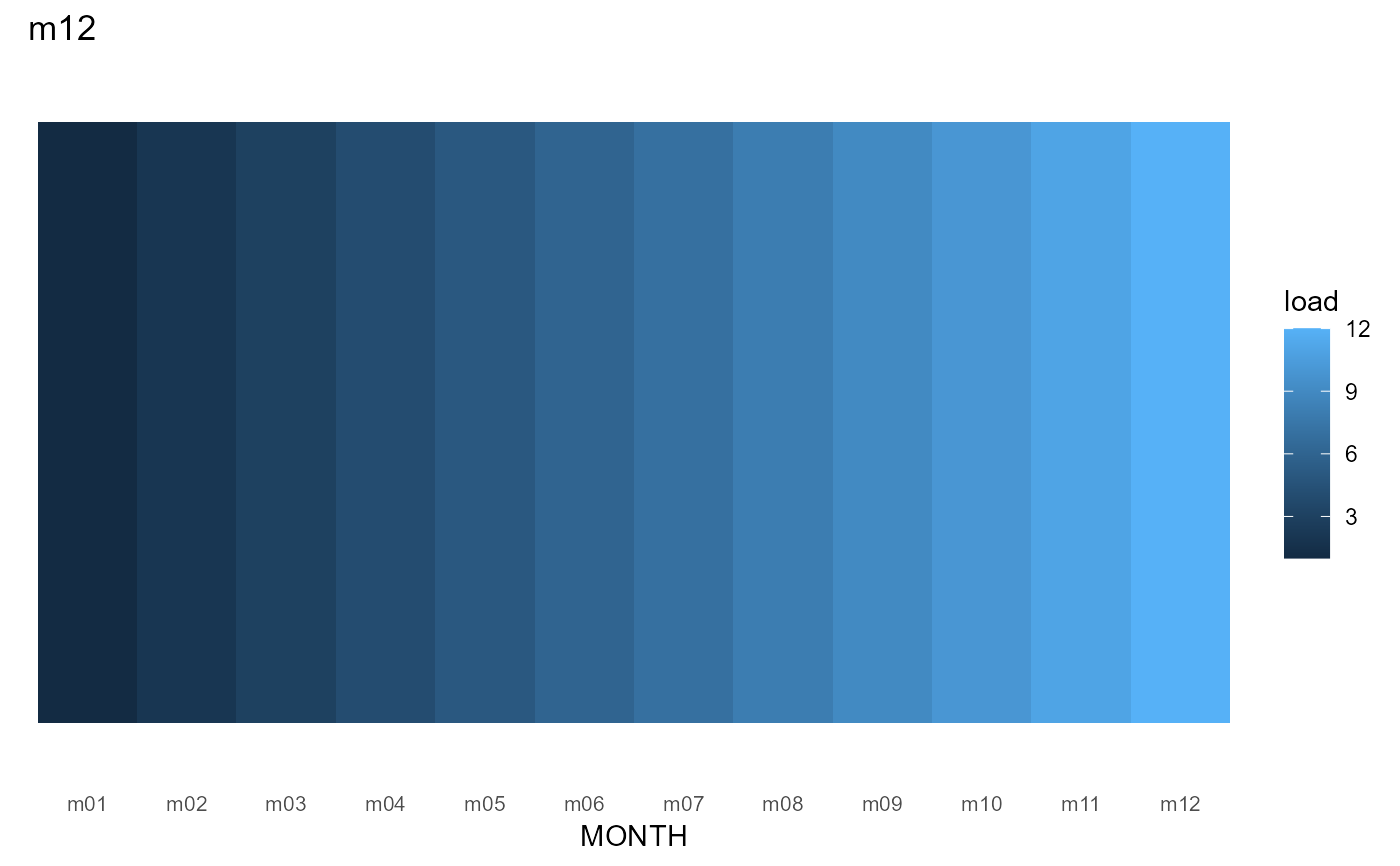
  cal <- calendar("m12")
  x <- data.frame(timeslice = sprintf("m%02d", 1:12), load = 1:12)
  calendar_plot(cal, x)
}