
The catalog
timescales ships a curated catalog of named calendar
designs, ported from the predecessor timeslices package.
Every id can be built fresh with calendar(id), and the same
objects come pre-built in the calendars dataset:
cal <- calendar("m12_h24")     # build on demand
cal2 <- calendars$m12_h24      # pre-built package data
identical(calendar_leaftable(cal), calendar_leaftable(cal2))
#> [1] TRUE
Coverage says how the design relates to a real year:
complete (every instant has a timeslice),
truncated (a stylised year that drops instants —
d365 has no Feb 29), or representative
(timeslices stand for recurring types rather than a partition of the
timeline — q4_h24 is a representative day per quarter).
Regularity flags designs whose timeslices differ in
length within a level (m12_md365: February is short).
The full table is one calendar_catalog() call; below it
comes in families, each with one member drawn as an icicle
(autoplot(); widths are the timeslice shares, the
ANNUAL root on top).
Days of the year
Plain day counters, optionally with hours: the full-resolution
workhorses (d365_h24 is the classic 8,760) and the stylised
360/364-day years some models use.
fam("^d3[0-9]{2}(_h24)?$")| id | timeframes | n_timeslices | coverage_class | regularity |
|---|---|---|---|---|
| d360 | YDAY | 360 | truncated | regular |
| d364 | YDAY | 364 | truncated | regular |
| d365 | YDAY | 365 | truncated | regular |
| d366 | YDAY | 366 | complete | regular |
| d360_h24 | YDAY/HOUR | 8640 | truncated | regular |
| d364_h24 | YDAY/HOUR | 8736 | truncated | regular |
| d365_h24 | YDAY/HOUR | 8760 | truncated | regular |
| d366_h24 | YDAY/HOUR | 8784 | complete | regular |
ggplot2::autoplot(calendars$d365_h24)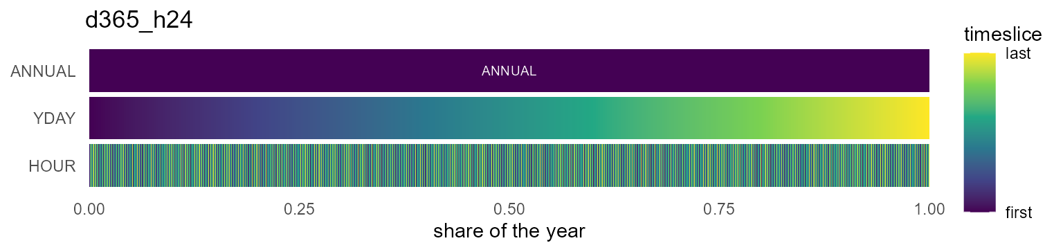
Months
Twelve calendar months (m01..m12, or
JAN..DEC as m12a), optionally with a
representative day of 24 hours.
fam("^m12(a|_h24|a_h24)?$")| id | timeframes | n_timeslices | coverage_class | regularity |
|---|---|---|---|---|
| m12 | MONTH | 12 | complete | regular |
| m12a | MONTH | 12 | complete | regular |
| m12_h24 | MONTH/HOUR | 288 | complete | regular |
| m12a_h24 | MONTH/HOUR | 288 | complete | regular |
ggplot2::autoplot(calendars$m12_h24)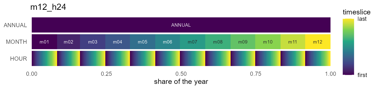
Month x day-of-month
A real month/day structure — non-Cartesian, February is short — for data keyed by month and day-of-month.
fam("^m12_md")| id | timeframes | n_timeslices | coverage_class | regularity |
|---|---|---|---|---|
| m12_md360 | MONTH/MDAY | 360 | truncated | regular |
| m12_md360_h24 | MONTH/MDAY/HOUR | 8640 | truncated | regular |
| m12_md365 | MONTH/MDAY | 365 | truncated | irregular |
| m12_md365_h24 | MONTH/MDAY/HOUR | 8760 | truncated | irregular |
| m12_md366 | MONTH/MDAY | 366 | complete | irregular |
| m12_md366_h24 | MONTH/MDAY/HOUR | 8784 | complete | irregular |
ggplot2::autoplot(calendars$m12_md365)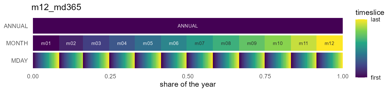
Quarters and seasons
Four calendar quarters, or the meteorological seasons
(WIN = Dec-Feb — a season straddles the year boundary,
which is why it is its own axis).
fam("^(q4|s4)(_h24)?$")| id | timeframes | n_timeslices | coverage_class | regularity |
|---|---|---|---|---|
| q4 | QUARTER | 4 | complete | regular |
| s4 | SEASON | 4 | complete | regular |
| q4_h24 | QUARTER/HOUR | 96 | representative | regular |
| s4_h24 | SEASON/HOUR | 96 | representative | regular |
ggplot2::autoplot(calendars$s4_h24)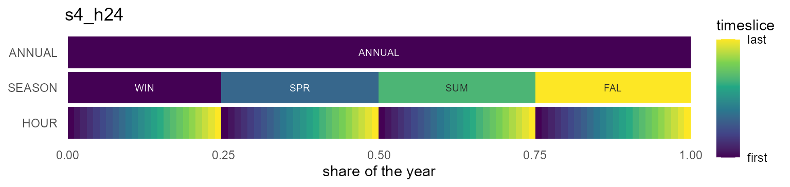
Weeks
52 or 53 weeks, with a representative day (_h24) or the
full 168-hour week (_h168).
fam("^w5")| id | timeframes | n_timeslices | coverage_class | regularity |
|---|---|---|---|---|
| w52 | WEEK | 52 | truncated | regular |
| w53 | WEEK | 53 | complete | regular |
| w52_h24 | WEEK/HOUR | 1248 | representative | regular |
| w53_h24 | WEEK/HOUR | 1272 | representative | regular |
| w52_h168 | WEEK/WHOUR | 8736 | truncated | regular |
| w53_h168 | WEEK/WHOUR | 8904 | complete | irregular |
ggplot2::autoplot(calendars$w52_h24)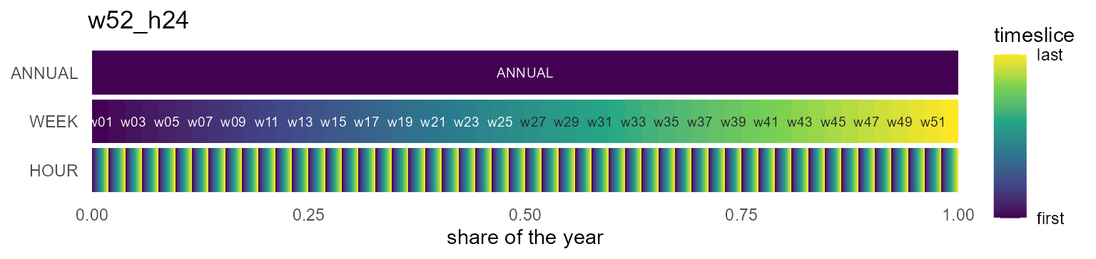
Weekdays and day types
The seven weekdays, or the compact workday/weekend pair — the smallest designs that still resolve a weekly demand cycle.
fam("^(wd7|wk2)")| id | timeframes | n_timeslices | coverage_class | regularity |
|---|---|---|---|---|
| wd7 | WDAY | 7 | representative | regular |
| wd7_h24 | WDAY/HOUR | 168 | representative | regular |
| wk2 | DAYTYPE | 2 | representative | regular |
| wk2_h24 | DAYTYPE/HOUR | 48 | representative | regular |
ggplot2::autoplot(calendars$wk2_h24)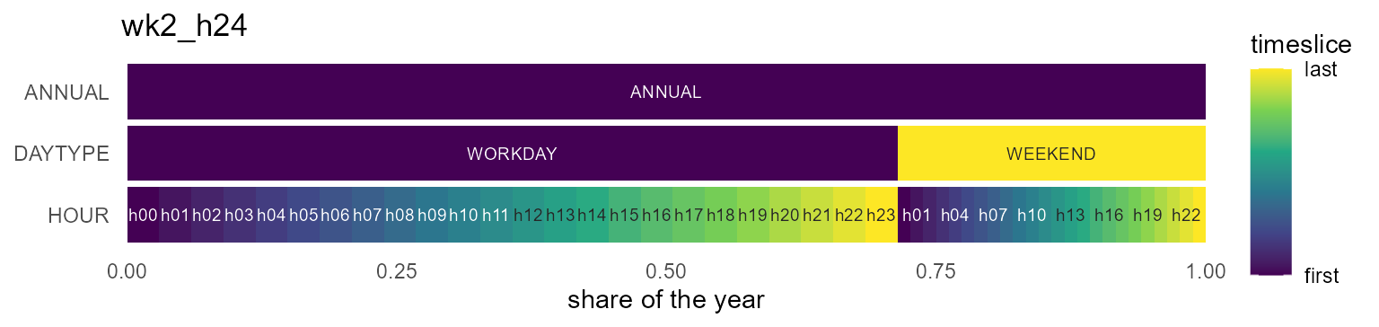
Hour types
DAY/NIGHT/PEAK hour classes on
their own or under a coarser axis — the “typical periods” family.
fam("hp3$")| id | timeframes | n_timeslices | coverage_class | regularity |
|---|---|---|---|---|
| hp3 | HOURTYPE | 3 | representative | regular |
| d365_hp3 | YDAY/HOURTYPE | 1095 | representative | regular |
| m12a_hp3 | MONTH/HOURTYPE | 36 | representative | regular |
| s4_hp3 | SEASON/HOURTYPE | 12 | representative | regular |
| q4_hp3 | QUARTER/HOURTYPE | 12 | representative | regular |
ggplot2::autoplot(calendars$s4_hp3)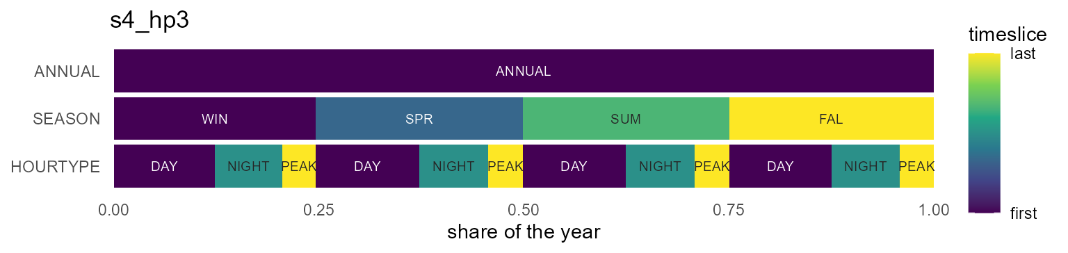
Fiscal years (April-start)
The same designs anchored to April 1 — Indian fiscal reporting; note
the member order starting at m04/Q2 (details
in the Fiscal years section
below).
fam("^fy04")| id | timeframes | n_timeslices | coverage_class | regularity |
|---|---|---|---|---|
| fy04_m12 | MONTH | 12 | complete | regular |
| fy04_m12_h24 | MONTH/HOUR | 288 | complete | regular |
| fy04_q4 | QUARTER | 4 | complete | regular |
| fy04_q4_h24 | QUARTER/HOUR | 96 | representative | regular |
| fy04_d365 | YDAY | 365 | truncated | regular |
| fy04_d365_h24 | YDAY/HOUR | 8760 | truncated | regular |
ggplot2::autoplot(calendars$fy04_m12)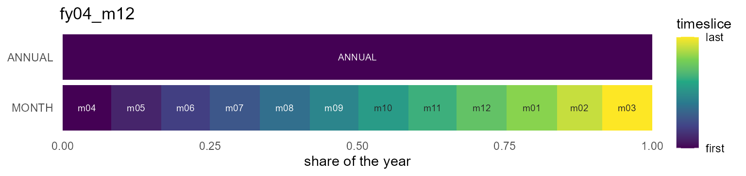
Shares are duration-proportional
Unlike the timeslices originals — which gave every timeslice a uniform share — catalog calendars weight timeslices by real duration:
m12 <- calendars$m12
data.frame(timeslice = calendar_leaftable(m12)$timeslice, share = round(calendar_leaftable(m12)$share, 4))[1:3, ]
#>   timeslice  share
#> 1       m01 0.0849
#> 2       m02 0.0767
#> 3       m03 0.0849
January is 31/365 of the year, not 1/12.
This is what makes recast_calendar(rule = "sum") conserve
and weighted_mean weight correctly.
The workhorses
The designs most models start from:
calendars$d365_h24    # 8,760 hourly timeslices, the full-resolution classic
#> Calendar: d365_h24
#> Timeframes (2):
#>   - YDAY (365) [token: d365, alignment: drop_feb29]
#>   - HOUR (24) [token: h24]
#> Leaf timeslices: 8760
#> year_fraction: 1
#> year_start: month=1, day=1
#> utc_offset_minutes: 0
calendars$m12_h24     # 288 timeslices: representative day per month
#> Calendar: m12_h24
#> Timeframes (2):
#>   - MONTH (12) [token: m12]
#>   - HOUR (24) [token: h24]
#> Leaf timeslices: 288
#> year_fraction: 1
#> year_start: month=1, day=1
#> utc_offset_minutes: 0
calendars$q4_h24      # 96 timeslices: representative day per quarter
#> Calendar: q4_h24
#> Timeframes (2):
#>   - QUARTER (4) [token: q4]
#>   - HOUR (24) [token: h24]
#> Leaf timeslices: 96
#> year_fraction: 1
#> year_start: month=1, day=1
#> utc_offset_minutes: 0
The m12_md* family carries a real month/day structure
(non-Cartesian — February is short), useful when data arrives keyed by
month and day-of-month:
md <- calendars$m12_md365
nrow(calendar_leaftable(md))
#> [1] 365
head(calendar_leaftable(md)[calendar_leaftable(md)$MONTH == "m02", ], 2)
#>    MONTH MDAY       share timeslice weight
#> 32   m02  d01 0.002739726   m02_d01     24
#> 33   m02  d02 0.002739726   m02_d02     24
tail(calendar_leaftable(md)[calendar_leaftable(md)$MONTH == "m02", ], 1)   # Feb ends at d28
#>    MONTH MDAY       share timeslice weight
#> 59   m02  d28 0.002739726   m02_d28     24
datetime_to_timeslice(as.Date(c("2021-03-15", "2020-02-29")), md)  # Feb 29 -> NA
#> [1] "m03_d15" NA
Type axes: SEASON, DAYTYPE, HOURTYPE
Three derived timeframes back the compact “typical periods” designs — and unlike in timeslices, they are fully datetime-convertible:
-
SEASON— meteorological:WIN= Dec–Feb,SPR,SUM,FAL -
DAYTYPE—WORKDAY(Mon–Fri) /WEEKEND -
HOURTYPE—NIGHT(h22–h05),PEAK(h17–h20),DAY(the rest)
dtm <- as.POSIXct(c("2021-01-15 03:00", "2021-01-16 18:00",
                    "2021-07-14 12:00"), tz = "UTC")
datetime_to_timeslice(dtm, calendars$s4_hp3)
#> [1] "WIN_NIGHT" "WIN_PEAK"  "SUM_DAY"
datetime_to_timeslice(dtm, calendars$wk2_h24)
#> [1] "WORKDAY_h03" "WEEKEND_h18" "WORKDAY_h12"
The mappings are defaults, not dogma — register your own token
(e.g. a different peak window) with
register_calendar_token() and build a custom calendar from
it.
Fiscal years: the fy04_* family
Many reporting systems run April..March — Indian national statistics
most prominently. The fy04_* entries
(fy04_m12, fy04_m12_h24, fy04_q4,
fy04_q4_h24, fy04_d365,
fy04_d365_h24) anchor the model year to April 1: model year
y spans [y-04-01, y+1-04-01), and the anchored
YEAR is the starting Gregorian year (Indian “FY
2021-22” is model year 2021).
fy <- calendar("fy04_m12")
fy@members$MONTH                       # April first
#>  [1] "m04" "m05" "m06" "m07" "m08" "m09" "m10" "m11" "m12" "m01" "m02" "m03"
g <- expand_calendar(fy, 2021, by = "day")
range(as.Date(g$datetime))             # 2021-04-01 .. 2022-03-31
#> [1] "2021-04-01" "2022-03-31"
datetime_to_timeslice(as.Date("2022-01-15"), fy)   # January stays m01
#> [1] "m01"
Two rules keep fiscal calendars unambiguous:
-
Labels stay Gregorian. April is
m04and Apr–Jun isQ2, always; only the member order starts at the anchor (m04..m03,Q2,Q3,Q4,Q1). Fiscal-renumbered labels would silently collide with the Gregorian label matcher. -
The catalog is UTC. Data already in Indian local
time maps as-is; to map true-UTC instants at Indian midnight boundaries,
pass the IST offset:
calendar("fy04_m12", utc_offset_minutes = 330L). (Constant offsets only for now — Olson time zones / DST are a planned later phase.)
Leap years take care of themselves: fy04_d365 drops the
Feb 29 that falls in the following Gregorian year (FY2023
contains 2024-02-29) and keeps March aligned to d365. Any
other anchor works by argument on any design:
calendar("m12", year_start = list(month = 7L, day = 1L)).
Visualizing calendars
(For the full plot-type tour on real data – heatmap layers, wall calendars, profiles, ribbons, duration curves – see Visualization.)
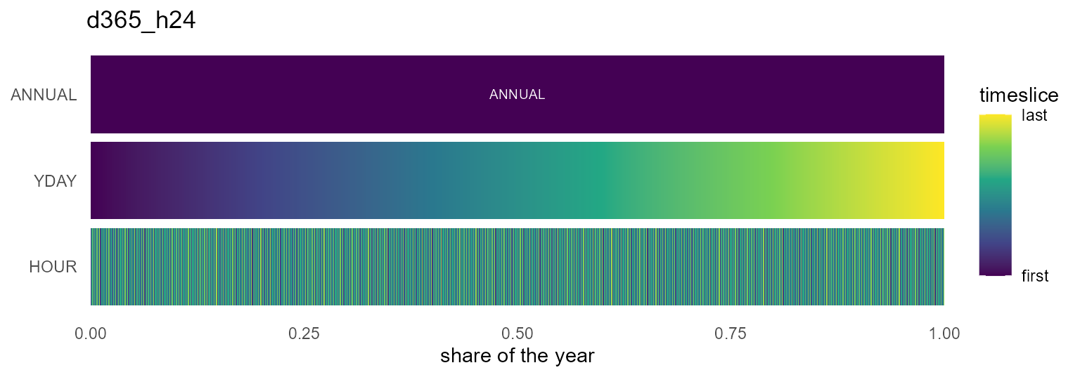
autoplot() (or plot()) draws a calendar’s
structure as an icicle: one band per timeframe with the
ANNUAL root on top, rectangle widths equal to timeslice
shares, x spanning the year on [0, 1]. The gradient
restarts inside each parent (color_pattern = "within"), so
nested structure is visible at a glance — the catalog tour above shows
one per family. Dense calendars stay fast: rows beyond
max_segments are binned before drawing:
The same figure carries data: pass
data =/z = and every band fills with the value
recast to that band’s resolution — here a year of Reykjavik wind, from
the annual mean down to the month × hour grid:
wind <- merra2_cities |>
  filter(city == "Reykjavik") |>
  mutate(timeslice = datetime_to_timeslice(datetime, calendars$m12_h24)) |>
  summarise(W50M = mean(W50M), .by = timeslice)

autoplot(calendars$m12_h24, data = wind, z = "W50M",
         rule = "weighted_mean", year = 2019) +
  labs(fill = "m/s")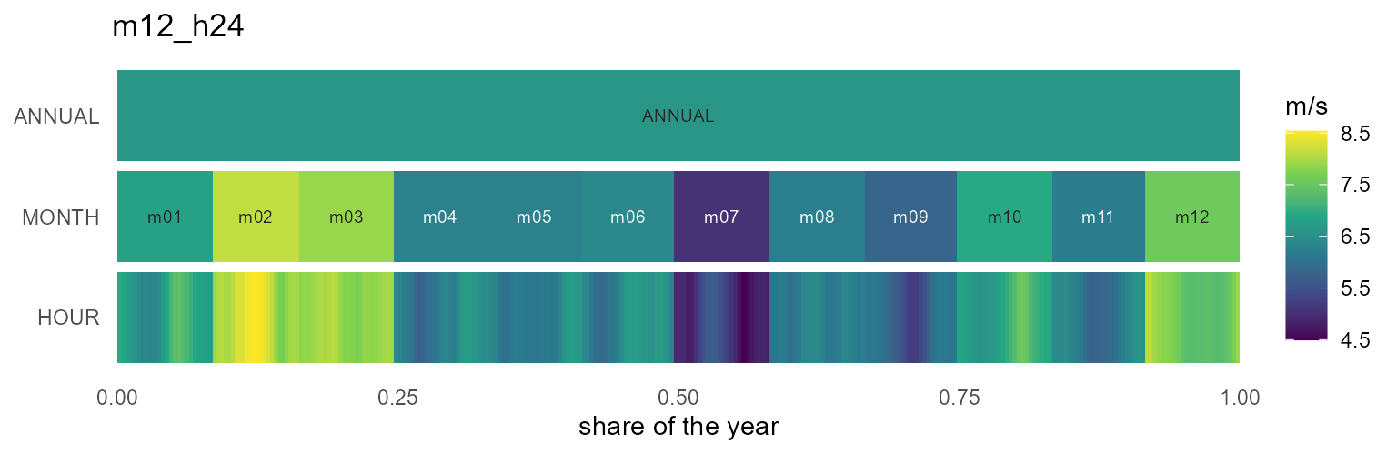
The geometry itself is available without ggplot2 via
calendar_layout() — a plain data.frame of
rectangles, usable from any plotting system:
head(calendar_layout(calendars$q4_h24), 7)
#>   timeframe  label timeslice rank       xmin       xmax ymin ymax      share
#> 1    ANNUAL ANNUAL    ANNUAL    0 0.00000000 1.00000000    2  2.9 1.00000000
#> 2   QUARTER     Q1        Q1    1 0.00000000 0.24657534    1  1.9 0.24657534
#> 3   QUARTER     Q2        Q2    1 0.24657534 0.49589041    1  1.9 0.24931507
#> 4   QUARTER     Q3        Q3    1 0.49589041 0.74794521    1  1.9 0.25205479
#> 5   QUARTER     Q4        Q4    1 0.74794521 1.00000000    1  1.9 0.25205479
#> 6      HOUR    h00    Q1_h00    2 0.00000000 0.01027397    0  0.9 0.01027397
#> 7      HOUR    h01    Q1_h01    2 0.01027397 0.02054795    0  0.9 0.01027397
#>   weight order within
#> 1   8760     1      1
#> 2   2160     1      1
#> 3   2184    25      2
#> 4   2208    49      3
#> 5   2208    73      4
#> 6     90     1      1
#> 7     90     2      2
calendar_plot() is the data-on-calendar heatmap: hand it
a data.frame keyed by timeslice (or nothing, to see the
share structure). The layout follows the hierarchy — finest timeframe on
y, next on x, coarser levels as facets:
x <- data.frame(timeslice = calendar_leaftable(calendars$m12_h24)$timeslice)
x$load <- 80 + 40 * sin(seq(0, 6 * pi, length.out = nrow(x)))
calendar_plot(calendars$m12_h24, x, palette = "C")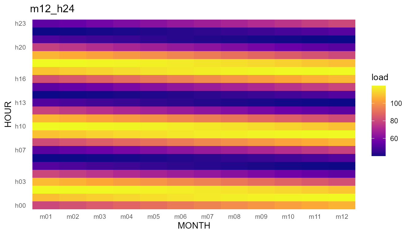
Wall calendars
calendar_wall_plot() draws the familiar wall form: one
facet per month, day cells in a week grid. The weekday arrangement is
year-specific (which weekday a date falls on comes from the base grid),
so pass year=; without it the layout falls back to a
year-free 7-wide sequence with a message.
calendar_wall_plot(calendar("m12_md365"), year = 2021)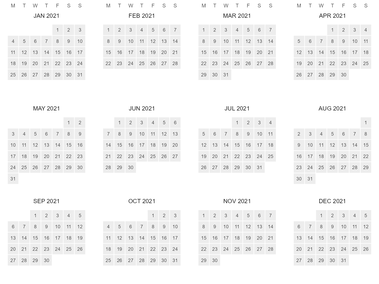
Daily (or finer – aggregated by fun) data fills the
cells, and the fiscal calendars facet April-first out of the box:
cal <- calendar("fy04_d365")
x <- data.frame(timeslice = calendar_leaftable(cal)$timeslice,
                v = cumsum(rnorm(365)))
calendar_wall_plot(cal, x, z = "v", year = 2021)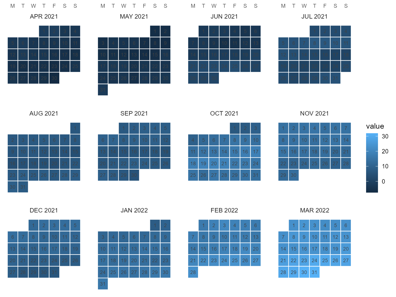
The pieces are reusable on their own:
calendar_weekdays(cal, year, week_start = "MON") tabulates
the day layer’s dates, weekdays, week-of-month rows and an anchored
week-of-year (fiscal weeks from April 1 for fy04_*;
week_start accepts any of MON..SUN), and
calendar_wall_layout() returns the plain tile frame the
figure is built from.
Recasting across the catalog
Any two catalog calendars convert into each other; totals are
conserved under rule = "sum":
x <- data.frame(timeslice = calendar_leaftable(calendars$m12)$timeslice,
                energy = c(310, 280, 300, 250, 220, 230,
                           260, 270, 240, 250, 280, 320))
recast_calendar(x, calendars$m12, calendars$s4, year = 2021, rule = "sum",
       by = "day")
#>   timeslice energy
#> 1       WIN    910
#> 2       SPR    770
#> 3       SUM    760
#> 4       FAL    770
sum(x$energy)
#> [1] 3210
Or aggregate within one calendar via the ANNUAL
root:
recast_calendar(x, calendars$m12, to = "ANNUAL", year = 2021, rule = "sum",
       by = "day")
#>   timeslice energy
#> 1    ANNUAL   3210